by John Ewing
In the last article, I started the discussion of post-processing techniques, covering corrective adjustments such as leveling horizon lines, simulating polarizing and graduated neutral density filters and correcting perspective distortion. This week, I want to move on to interpretive adjustments for landscape images, focusing specifically on enhancing atmospheric perspective by creating a stronger sense of depth within the image.
Before I get started, here are a couple of reminders about my personal workflow. First, I use Adobe Camera RAW (ACR) to complete basic global adjustments (i.e. white balance, contrast, initial sharpening, and color adjustment) before opening images in Photoshop (PS) for global fine tuning and local adjustments. Second, as with all digital manipulation, there are usually more than a couple of different ways to achieve the same results; my process should be considered one option. Third, I always recommend ensuring that your digital adjustments are done in a non-destructive manner so that you can go back and readjust if desired. Finally, in the spirit of full disclosure, I learned these techniques during my MFA program at AAU in courses such as Contemporary Landscape and Digital Imaging. If you aren’t familiar with ACR and PS, there is a wealth of information on the internet, including fantastic tutorials on the Adobe website.
As I mentioned above, we’re going to add depth to an image by enhancing atmospheric perspective. To achieve this, we’ll use luminosity, color and saturation to tweak the plastic interval, or the perceived space between objects. These techniques help overcome the inherent flatness of a photograph and increase the illusionary plasticity in the image so that it mimics our view of the real, three-dimensional world. We do this by paying attention to the visual properties that we can manipulate to spatially order the scene in a natural manner. As a reminder, warm colors, higher values, and more saturated hues all cause elements to visually advance in the visual plane, while cool colors, darker values, and desaturated hues tend to recede.
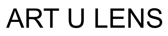
Using a sample image, I’ll demonstrate this process step-by-step. The image below, Left is the baseline RAW image processed in ACR, then opened and saved as a master .psd file. Within ACR, I made global adjustments to correct white balance and to enhance contrast across the image (i.e. adjustments using contrast, shadows, clarity, vibrancy, saturation and luminosity sliders) as well as enabling lens correction and dehazing. The image on the right shows the image with a curves adjustment layer added to decrease luminosity of the sky element and add contrast in the clouds. I used a layer mask to prevent these changes from being applied to the ground to add contrast in value between the sky and ground, which allows the sky to recede while pulling the foreground forward.
Original Image Imported from ACR (Left), Image with Curves Adjustment Layer (Right)
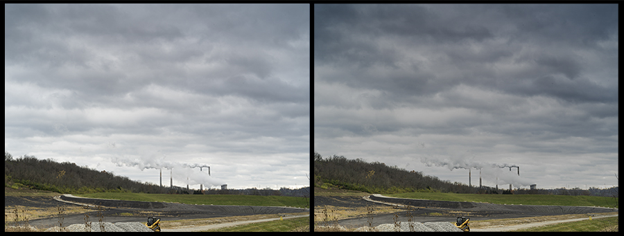
The next step is to enhance the chiaroscuro in the foreground by adding shadow and highlight details. The idea here is to create subtle value contrasts that help draw the eyes into the foreground. To accomplish this, add a new blank layer and set the blend mode to overlay, and label the layer “Luminosity.” Using the Brush Tool set to a low opacity (5 to 10%), darken shadows and lighten areas of contrast in the foreground, toggling between black and white in the Color Picker (Hit Shift+D to ensure the color picker is set to black and white, and toggle between the two by hitting Shift+X). The key is to make these changes just at the edge of perceptibility. If you find the effect is too strong, you can lower the overall opacity of the layer. (Left image below).

Image with Luminosity Layer (Left), Image with Hue Layer (Right)
Now, we’ll add a color wash, warm in the foreground and cool in the background, to continue to enhance the illusion of depth in the image. To get the desired effect, we’ll add a new blank layer, setting the blend mode to hue and labeling the layer as “Hue.” Using the Brush Tool, select a warm hue using the Color Picker (generally, a warm yellow to gold works best – anywhere between 45-60 on the color wheel). Setting your brush opacity to 50%, paint the hue over the foreground. If the effect is too strong, you can erase and retry at a lower brush opacity. Next, on the same layer, we’ll select a cool blue hue (210 – 250 on the color wheel), and paint over the sky. If the sky is dominant, such as in this example, paint the hue on heavier at the horizon, and lightening up on the top to give the effect of the sky looming overhead and becoming cooler as it moves to the horizon. You can also use a graduated fill layer to get a similar effect. The image above right shows the effect of the added Hue layer.
Next we’ll move on to adjusting saturation. First, add a new blank layer, setting the blend mode to Saturation and labeling it “Saturation.” Then, go to the Color Picker and set the current color to 100% saturation (since the blend mode is set to saturation, it doesn’t matter what the color is, it will only be impacting saturation). Again, using the Brush Tool set to a low opacity (3-5%), paint across your foreground to increase saturation a bit at a time until you get the desire effect. Next, go back to the Color Picker and drop saturation to 0% and switch brush opacity to 10% and begin painting at the horizon and working up into the sky. Again, the horizon line should be less saturated than the sky at the very top of the frame to add the perception of depth. The image below left shows the effect of the saturation changes.
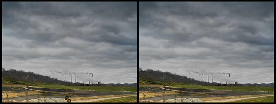
Image with Saturation Layer (Left), Image after Touch-Up Work (Right)
The final step at this point is to do any touch-up work you desire. In this image, I wanted to remove significant distractions as well as dust spots using both the Spot Healing Brush tool in the Content-Aware mode and the Healing Brush Tool. The image above right show the final image. Below are the starting and ending images for comparison.

Initial Image (Left), Final Image (Right)
I hope these techniques are of some use to you. If this method works for you, you may want to consider creating a custom Action to automatically create these adjustment layers and place them in their own Adjustment Layer Group. As I mentioned at the beginning, the tools I discussed are just one of multiple possible ways to accomplish these adjustments, and you may already have a process that works better with your overall workflow. The main idea is to find what techniques will work best for you.