The School of Photography winds down our FA17 semester at AAU with a shout to our students, past, present and future.
Modern Stereo Photography
by Shannon Polugar, MFA Student
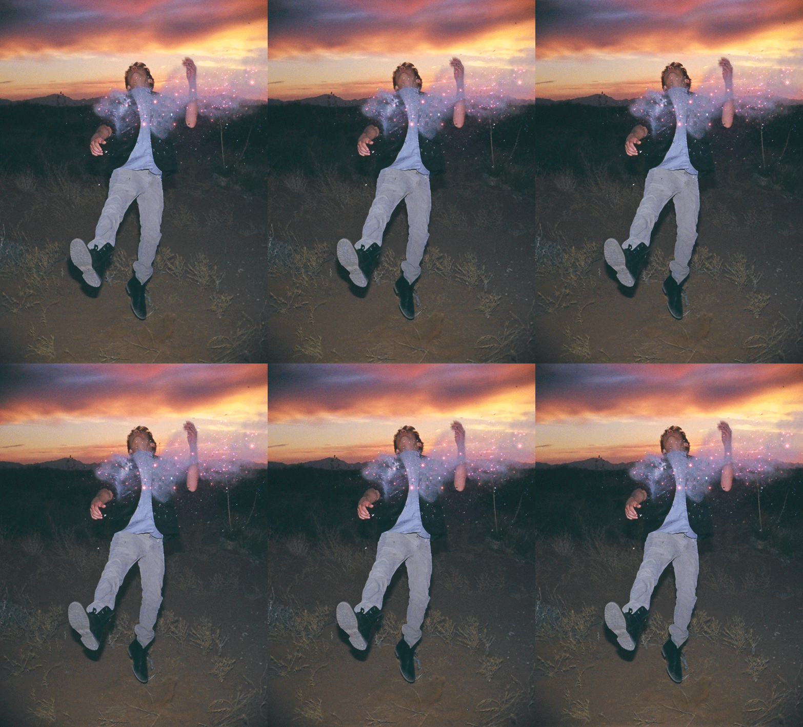
A modern stereograph photo by Ignacio Torres, taken with a standard DSLR camera, is actually four photographs in one
Late last month I found myself upstairs in the back of a large antique store, where a dozen or so metal filing cabinets stood containing photographs of all but the earliest of photographic types, along with baskets of photos covering the tops of the cabinets. I, however, was drawn to one particular type of photograph: the stereographs.
For a lover of old photographs, it is easy to spend half a day in a room like this, at an antique mall in Monterey, California. The stereoscope or ‘viewer’ hangs from the ceiling above the filing cabinets
I have long been fascinated by this type of photography. In the closet of my grandfather’s office were stereograph slides that he had taken of their time in Ecuador in the 1960s, along with the Grand Canyon a handful of years later. I could spend hours putting the slides into the viewer, amazed at how surreal the three-dimensional photos appeared. Whether it was these or the over 100-year-old stereograph cards I was sliding into a wood and glass viewfinder in the antique store, they all felt like I was not just viewing a moment in time, but stepping into that moment.
One photographer though has found a way to create that same stereoscopic, three-dimensional view, with the modern digital camera, and without a stereo lens. Ignacio Torres, a photographer based out of New York City but who has done extensive work in Mexico as well, created his “Stellar” series with this view in mind.
The elements of space and time within the photographs are heightened in Torres’s photographs, making one feel ‘in’ the moment rather than just viewing it flatly.
Torres describes that his intention in this series was to heighten the element of space and time, which he does by taking four individual photographs in very quick succession, and then placing those photographs together in an animated GIF to create the three-dimensional effect.
The same is done with old stereograph photos online, though it is only two images in this case. Torres’s work, adding the two additional frames, creates a much smoother look. His series also plays up the whimsical, using Photoshop in post-production to highlight the stardust (confetti), to “serve as a visual metaphor to the spatial link we share with the stars.”
While older stereographs can be viewed digitally through a similar process, they don’t appear as smooth as Torres’s work
However, unlike the two frame stereographs that can be slid into a viewfinder, Torres’s work can only exist in the digital world. The images cannot be printed and still viewed as he intended. To be viewed on a gallery wall they would need to be in a digital frame. So while the visual effect is similar, there is a disconnect with Torres’s modern stereographs with the old ones.
And I did leave the antique store a bit poorer monetarily and a bit richer in history, a handful of stereographs from 1905-1915 neatly wrapped in a paper bag, but also having these modern stereographs portably within reach, only a URL away on my phone.
http://www.1883magazine.com/arts/arts/ignacio-torres
http://abcnews.go.com/Technology/page/stellar-project-images-photographer-ignacio-torres-14474643
DIY Tabletop Lightbox
Artist/designer with a starving-artist budget? Need to photograph your work for a final presentation or your portfolio, but can’t afford a “studio grade” light box? No worries—make this instead.
Walker Evans and Vernacular America
Personal Thoughts on the Current Exhibition at the San Francisco Museum of Modern Art
by Brian Edwards
The San Francisco Museum of Modern Art is having an exhibition entitled Walker Evans that focuses on Evans’ interest in the vernacular. Running from September 30 to February 4, the show includes more than 300 prints of his work, a number of his paintings, postcards, and his personal scrapbook. [7] [9] Reading about this exhibition reminded me of how Walker Evans has influenced my own photographic work and perhaps even my view of the world.
I have often thought of the work of Walker Evans as a combination of social documentary and pre-topographic photography. He was one of the many Farm Service Administration (FSA) photographers that took scores of images documenting the Great Depression and influenced many of that same group of photographers. Stephen Shore has on numerous occasions cited Evans as an important influence on his own work; other photographers claiming similar influence include Robert Frank, Garry Winogrand, Diane Arbus, and Lee Friedlander. [10]
Walker Evans, Truck and Sign 1928-1930 [7] [9]
Another body of work that influenced some of my own has revolved around the notion of the vernacular landscape, which involves capturing the interaction between people and the landscape over time. One principal advocate of this point of view is the writing, photography, and painting of John Brinckeroff (J.B.) Jackson. [2] This movement departs from the modernist view of the landscape perhaps best represented by the work of Ansel Adams, but also departs from the romanticized view of landscapes represented by painters like John Constable, Thomas Gainsborough, and JMW Turner. [8] Adams’ vision of the landscape was diametric to the vernacular view, namely, his vision of the landscape involved representing the landscape in more romantic terms and for the most part reflected a pre-Anthropocene (before the climate and environment were influenced by humans) view of how a landscape image should look. Like the New Topographics movement of the 1970s, the vernacular landscape emphasizes that very interaction. [6]
John Constable, Mill at Gillingham, Dorset, 1825-1826 [4]
What distinguished Jackson’s work from many of the New Topographic photographers is the less formal approach to image-making. The formal, objective view of Bernd and Hilla Becher, for example, is clearly missing in Jackson’s images. [1] If anything, his images share more of what one would see in a collection of slides that just about any road traveler would take while on vacation, even though it’s very likely that subject matter would differ. The common thread is the lack of any attempt to romanticize the landscape.
J.B. Jackson, Collins, Hot Coffee [3]
A thread that runs through much of my own work is a sense of the vernacular, motivated in part by my interest in urban design, the economic viability of small towns, and rural landscapes. My use of tilt-shift lenses, on the other hand, reintroduces some of the formality and objectivity that we see in many of Ansel Adams’ romanticized landscapes as well as in Stephen Shore’s very unromantic cityscapes, but the subject matter is clearly more in line with a more vernacular view of the landscape.
Brian K. Edwards, Café, Encino, New Mexico, 2017
The focus of the San Francisco Museum of Modern Art is the vernacular side of Walker Evans’ work reflecting his own interest in the “surface of everyday life” that “highlights Evans’s [sic] fascination with American popular culture.” [7] Evans’ images of buildings, storefronts, and urban spaces are well known, as is his work documenting the people of his time, but an interesting thread that runs parallel to so much of his work is an interest in the everyday, whether it be a shot of a couple on a New York subway, or another postcard-like shot of a couple on Coney Island. This exhibition sheds a different light on one of the more important photographers of the twentieth century.
Walker Evans, Couple at Coney Island, New York, 1928 [5]
Sources
[1] Bernd and Hilla Becher, Basic Forms of Industrial Buildings, Schirmer/Mosel, 2005.
[2] John Brinckeroff Jackson, Discovering the Vernacular Landscape, Yale University Press, 1998.
[3] John Brinckeroff Jackson, Collins, Hot Coffee, Part of the Chris Wilson Collection of J.B. Jackson American Slides, University of New Mexico University Libraries, http://libguides.unm.edu/cswr/jbjackson/conference
[4] John Constable, Mill at Gillingham, Dorset, 1825-1826, John Constable – the Complete Works, https://www.john-constable.org/the-complete-works.html?pageno=2
[5] Walker Evans, Couple at Coney Island, New York, 1928, The Met, Heilbrunn Timeline of Art History, Walker Evans, http://www.metmuseum.org/toah/artist/walker-evans/
[6] Claire O’Neill, New Topographics (Redux), The Picture Show, National Public Radio, June 20, 2009, http://www.npr.org/sections/pictureshow/2009/06/topographics.html
[7] PDN, Walker Evans’s Vernacular America, September 29, 2017, https://potd.pdnonline.com/2017/09/48657/#gallery-1
[8] Michael Prodger, Constable, Turner, Gainsborough and the Making of Landscape, The Guardian November 23, 2012, https://www.theguardian.com/artanddesign/2012/nov/23/constable-turner-gainsborough-making-landscape
[9] San Francisco Museum of Modern Art, Walker Evans: Exhibition, September 30, 2017 – February 4, 2018, https://www.sfmoma.org/exhibition/walker-evans/
[10] John Szarkowski, Walker Evans: American Photographer, Encyclopedia Britannica, https://www.britannica.com/biography/Walker-Evans
The New Palm-Size Camera, Should We? Or Should We Not?
by MFA student Karineh Gurjian.
I have to say I love technology and gadget that are so “techi” going to CES for me is like being a kid in a candy store. Yes I love my traditional photography training and shooting a 8x10 transparency is a totally different experience. My body does go into a shock when I hear someone tell me well I can shoot the same thing you are shooting with my iPhone. But I know any camera from a pinhole to an iPhone, when the camera is in the hands of a trained eye and a trained professional the image will be something very different than someone just snapping away.
With that being said here is the latest in the line of attachments for your phone. The DxO One is a small camera that plugs into an iPhone to radically improve the quality of photos you can take while on the go. It has a lens and sensor, similar to what you might find in an advanced compact camera like the Sony RX100 IV, but borrows your phone's screen so the camera itself can stay absolutely tiny.
It's neat, fun to use and delivers photos comparable to other cameras with similar specs. But it also has some quirks and a relatively high price tag. It costs $600 in the US.
Design and features
The design is clever, but has some annoyances. The system consists of a palm-size rectangular camera and an iPhone or iPad app. The front cover slides over the lens. When you slide it down, it turns the camera on; pushing it down again pops an Apple-standard Lightning connector out of the side of the body. I don't like that you have to push it down to get the connector back in, though, because it usually means turning the camera back on in order to do so.
The camera has a real two-stage shutter button (for half-press prefocusing), though the camera uses an electronic shutter.
Image quality
Saying the One's photo quality is significantly better than the iPhone 6 Plus' is true, but it's also an unfair comparison: the One's a full-featured camera with a bigger sensor and faster f1.8 lens with a physical aperture that you can vary for real control over sharpness zones. The company says that in good light the photos are about the same, but that's only if you only plan on viewing them on theiPhone screen.
Even on an iPad I think they're much better, if only because the higher resolution -- 20 megapixels vs. the iSight camera's 8MP -- provides more detail and the One's color and exposure are tons better.Relative to cameras like the Sony RX100 series or Canon G7 X the One produces somewhat better in-camera JPEGs.
The low-light results from SuperRaw processing look somewhat better than out-of-camera JPEGs from other cameras, but the default JPEGs look a little worse, as if the One doesn't have enough power to do as good a job as a standalone camera.
At the end if I had extra $500.00 I would buy it and play around with it but for now I can wait and see what the second generation of the camera is going to be like.
Getting Past a Creative Block
by Sarah Sloneker. Images above © Sarah Joy Photography.
As an artist, we have all been there … when just for the life of us we cannot get our creative juices flowing. We have that dreaded creative block and it usually there to stay for a while. However, over the years, I found and read some interesting ideas on how to “Drano” away that block and get us artist’s back into that creative grind.
I recommend trying one of these four things:
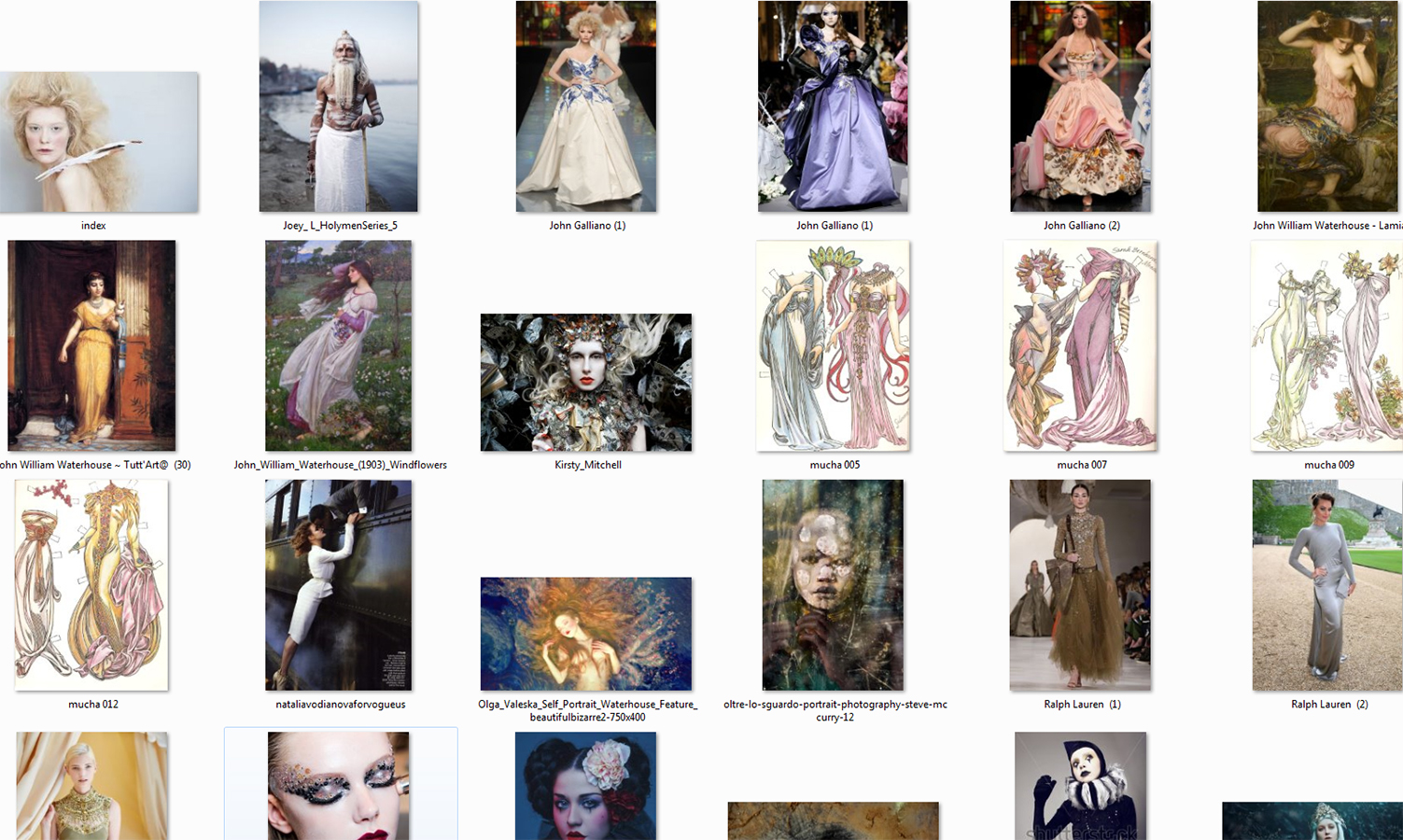
1. Have an Idea Box or Folder- Being visual people, we can be inspired by a lot of different avenues such as objects, ideas, notes, sketches, painting and of course other photos. So when you are feel uninspired, I recommend creating a box or an image cloud. A place where you can save things to spark your creativity. I myself have a “mood board” folder on my computer.. That I regularly store anything visual that grabs my eye (of course saving and naming the image properly). One will be surprised how helpful this can be as a reminder of previous ideas and inspirations.
2. Stimulate Non-Visual Senses- As photographers; most of us work primarily with our sense of sight. Therefore, I recommend resetting your senses. Recently I went into a sensory depravation tank, this is where you are floating in a black void for about an hour or so with no sight, sound, smell or touch and coming out from this tank was amazing. You won’t believe how creative you can be after you reset your body. However, you do not have to go as far as hoping in a deprivation tank to get this experience. Try just taking one sense away, for example: Close your eyes and touch the grass outside or the drywall in your apartment, just pay attention to that ONE sense. Eat an ice-cream cone with your eyes closed or lie on the floor and listen to music in the dark. Anything that gets you experiencing your other senses in a new way, and will help your art by widening your creative outlook.
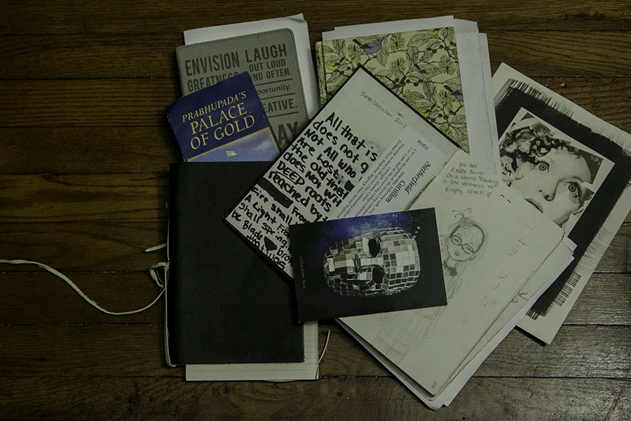
3. Write Something or Sketch it- Journaling can be a fantastic creative outlet, I myself have many journals. Often enough, it is said that handwriting is linked directly to your consciousness, and by writing down your ideas, it keeps your thoughts moving. It’s a way of organizing and remembering things that have affected you, so you can channel that into your art.
4. Clean Your Work Space- This might sound weird, but having an empty table as an artist can really help your metal mode. For having a cluttered studio space, doesn’t allow much room for new work to develop. I often find it therapeutic and refreshing to start a new image on fresh clean space, to allow my mind to calm down the outward chaos.. so to begin the creative cycle again.
Sample of my mood board folder (grouping of Images, not mine) and my creative journals.
Mastering The Cinematic Image with MFA Student Gregory Beams
Text and images by Gregory Beams.
Narrative Photographs
Narrative photographs are those that invoke a story for the viewer. Unlike books or movies, a photograph doesn’t convey the entire story, but rather, it invites the viewer to develop a story based on the scene and content presented within the photograph. Viewers bring their life experiences, including the books, movies, television, etc., they have read or seen, into their relationship with the photograph.
Movies & the Photograph
When people go to movies, they willingly set aside the reality of the world in which they live and enter a cinematic reality. This new reality is unique to each movie and defined by the story being presented on the screen. Movie goers don’t judge that cinematic world based on their life experience, but rather, they judge it for consistency within itself and what it portends to represent. Viewers develop a highly sophisticated understanding of the visual cues used by cinematographers to convey the story being presented by the movie. Attributes such as color, light& tonality, composition, etc., inform the viewer about the scene and its emotional meaning.
Photographers can access that narrative power by adopting a more cinematic aesthetic. This allows viewers to see cinematic photographs as frames from within a larger story. Viewers are then willing to look for the narrative being presented and willingly search for visual clues to understand what is happening within the image.
Whereas movies are presented on a timeline established by the movie itself and so viewers can’t stop to inspect scenes and content more closely, photographs are meant to be explored on a timeline established by the viewer. This allows viewers to examine a scene and consider the meaning of the characters and other content within the photograph. As a natural part of viewing a narrative photograph, viewers will consider what happened to the characters and content before the scene was frozen into the photograph and what will happen next. This becomes a key part of how the story is developed by the viewer.
Cinematic Images
Photographers can use the movie-goers’ visual sophistication in creating their narrative photographs by developing a more cinematic aesthetic. When viewers see a cinematic photograph, they inherently understand that there is a story for them to find and they willingly participate in developing that narrative.
In using a cinematic aesthetic, photographers provide visual cues that cause viewers to see the photograph as being from a larger narrative. The three main cues include composition, light and color.
Composition: Cinematographers use certain compositions such as close-ups, medium and long shots and variations of these compositions in order to provide context for viewers. Wide shots set the scene and inform viewers about the setting within which the characters are portrayed. Medium shots portray action and activity between a limited number of characters and content. Close-ups involve emotion and intimacy between the viewer and the character.
Light: Light establishes the visual importance of the characters and content within the scene and it conveys the mood or emotion associated with the scene. Viewers are drawn to brightness and contrast and so those are important attributes for informing the viewer about where to look for the important aspects of the image. The overall lighting and tonality sets the viewer’s emotional expectations about the overall scene and so will impact the type of story they develop. The overall lighting defines whether the scene is one of bright happiness, hope and triumph versus dark mystery, intrigue and despair. If the lighting is inconsistent with the intended emotional mood, then viewers will be visually confused and may misunderstand the photograph’s message or intent.
Color: Color is critical to creating cinematic photographs because movies use a consistent color palette that viewers are accustomed to. While cinematographers can and do deviate from these colors, these are artistic exceptions. Cyan, blues and greens are most often used for dark scenes with characters given a slight orange hue. Daylight scenes bring more color variety but are oftentimes given a bluer tone for dramatic movies and an orange or yellower tone for more romantic movies. Photographs that have a dominant hue across an entire image are also seen as cinematic and can create tension and drama.
Bringing consistency across all of the photographic attributers so that the composition, lighting and coloring work together to inform viewers about the emotion of a scene is important in their ability to understand what they are seeing and to engage them in developing a story about the photograph.
Cinematic photography lets photographers use the visual sophistication that viewers have developed through their movie-going experience to invoke a narrative within their photographs. Viewers see the image as a scene from a larger story and they willingly create a narrative not only of what they believe is happening within the photograph, but what has happened leading up to the photograph and what will happen next.
Only My Two Cents,
Gregory Beams
Editor's Note: Gregory Beams' work will be on display at AAU's 625 Sutter Gallery during the month of October.



![Walker Evans, Truck and Sign 1928-1930 [7] [9]](https://images.squarespace-cdn.com/content/v1/55ccfc39e4b0ff38cd532d8c/1508538093787-VLHSTOXG3ASMJOCE5SKZ/WalkerEvansTruckAndSign.jpeg)
![John Constable, Mill at Gillingham, Dorset, 1825-1826 [4]](https://images.squarespace-cdn.com/content/v1/55ccfc39e4b0ff38cd532d8c/1508538157946-KGU2FLFUDAKZMNAME9W5/JohnConstableMillAtGillinghamDorset182526.jpeg)
![J.B. Jackson, Collins, Hot Coffee [3]](https://images.squarespace-cdn.com/content/v1/55ccfc39e4b0ff38cd532d8c/1508538228916-SHJQMTQKD1BTA0K1ABKJ/static1.squarespace.com.png)

![Walker Evans, Couple at Coney Island, New York, 1928 [5]](https://images.squarespace-cdn.com/content/v1/55ccfc39e4b0ff38cd532d8c/1508538378817-85OT3RBZY411ZCPTBURU/WalkerEvansCoupleConeyIsland.jpeg)

