
A Demo by Brian Kyle
The Power of a Meaningful Image and a Photographer’s Despair
by Santosh Korthiwada
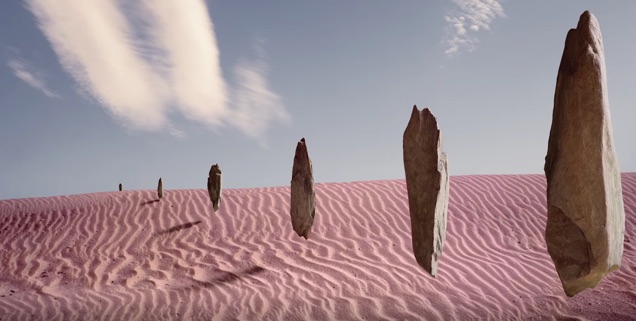
Imagine that you are standing on the edge of a still water lake. The water is still, the scene is serene, everything is so calm and quiet that you could hear your own breathing. You stand there for a while and think Oh no! Why it is so quiet here when there is so much chaos out there? So, you take a small rock, gather all your strength and throw it as far as you can. You hold your breath with anticipation. The rock takes the flight and speed, reaches a certain height, distance and starts going down. Faster and faster and ‘SPLOSH!’ – makes a noise, splashes the water as your rock hits the surface of water.
You are witnessing the entire scene and see that the impact created a ripple in the calm waters. The circular, wavy ripple goes on for a distance and the waves get smaller and smaller and finally disappear. The lake went back to its previous state of being still, there is no movement and there is no sign of the ripple you created. You think, that’s it; it’s over. Nothing has changed; you couldn’t change a thing! You give up in despair.
Well you are wrong! Because a lot has changed. At least a couple of things to start with;
1. It might seem that the lake has gone back to its previous state. It can never ever go back to its previous state of being still as your ripple permanently altered it. Now the current still lake is “a lake whose waters were once splashed and rippled”.
2. Because you were standing outside & above the lake, you only saw the surface. You didn’t get to see how far and deep your rock traveled into the depths of water. It has traveled until it reached the bottom of the lake and as it traveled, it continued to pierce the stillness of the lake and created innumerable internal ripples.
Just because you couldn’t see it, doesn’t mean it never happened.
Now imagine this. Replace the lake with human consciousness and replace the rock you threw in the lake, with a photograph you made, with a story you told and a life you touched. The impact it created is physically visible only on the surface, to you. But it continued for a long time but invisible to the naked eye. The deeper the lake, the larger the rock, the stronger the ripple. You have permanently altered human consciousness with a meaningful photograph. Once we witness the meaning, our consciousness can never go back to its previous state, thought it might appear to be. The transformation is still happening as it takes various forms and touches lives in various ways that we can’t fully imagine or understand.
But remember, that if you choose to through a rock made of salt, irrespective of your strength, it will travel the shortest distance in air, make the tiniest sound, create the smallest ripple and disintegrate on surface and never get to see the bottom of the lake. So, choose your rock carefully and that is your responsibility.
Finally, don’t think you are alone. Sure, you must be standing alone on the edge of this lake. But there are many lakes and many edges. You might not realize it but your rock does. It knows that it’s not alone when it sees many other rocks of all shapes, colors and sizes welcome it to the bottom of the lake. You are not the first one to throw a rock, standing on that edge of this lake and you won’t be the last one. As more and more meaningful rocks are thrown into the lake, they collectively raise the level of the waters.
Your search for meaning and contributing a meaningful photograph is actively expanding our consciousness. Despair or otherwise, this is the truth of photography and a photograph.
The Print
by Jody Lepinot
I recently received an email from Epson that contained links to short videos in which several professional photographers were discussing the relevance of the print in today’s electronically oriented society. They each talked a bit about their work and their inspiration, and then about the importance of the print. You might have guessed that the discussions would come around to printing when Epson is involved, but it was not an ad for printers, but a personal appreciation of the print itself.
J. P. Caponigro, creator of what he describes as “visionary landscapes with impossible symmetries” says that for him “looking at prints is an event”. He believes that looking at prints make you slow down and really consider something. A viewer of his work once said that he had seen one of his images before on the web, but until he saw the print, he never really understood it. Caponigro accepts printing as a challenge to help him understand his images and his vision more clearly. He loves the feel of the matte paper he chooses to print on. It adds to the organic feel of his images. The print to Caponigro is durable, it persists in your environment, and doesn’t go by in a millisecond as an image on a screen does. It is his legacy.
Jeremy Cowart, fine art portrait photographer says “when you nail a print, it’s so much better than anything a screen can ever represent”. He has a great interest in paper. Cowart feels that a print on paper is special to hold in your hands, and the feel of the paper itself contributes a different feeling to the print. He says that you notice the light, composition and color in a different way in a print than on screen, and that you have to experience it to understand that.
Gregory Crewdson describes his photographs as “pictures concerned with coming together of beauty and sadness - the tension between stillness and unease - about a search to make a connection with something larger than yourself. For Crewdson, looking at the print is like being for the first time engaged in a description of his own world as an artist. He sees the meaning in the smallest detail in a way that he can’t on a computer screen. He wants viewers to come up close to his prints and not have anything like grain or any printing artifact in the way. His prints are of exquisite quality. He leaves a 3” border around each one, and frames them without matting so that the paper becomes part of the experience of the picture.

Steve McCurry says that his images are about spontaneity. He has explored many countries and cultures and shares with us his interest in human behavior and the human condition. McCurry says that he wants people to remember his work through the prints he has created. He compares them to a book or novel - something well-crafted that you want to touch and feel.
For Mark Seliger, “the end result is obviously a print”. Seliger is a portrait photographer, drawn to a subject’s essence, to share their experience. He feels that the print is a much more fulfilling experience for the viewer than looking at a computer screen. Seliger says “when an image is transformed into a final print… it becomes an object…and the image takes on a dimensional quality with tactile feeling…” He says that each time you view a print, it tells a different story. That idea that the print will outlast the photographer is important to Seliger. Permanence and stability make power.
Steven Wilkes’ photographs celebrate what he finds beautiful. He tells difficult stories in powerful, poignant, yet beautiful ways. For him, “the quality of the print is everything.“ He feels that all of the steps in his work are reflected by the print, and the print is the original. Wilkes says that he doesn’t know how long a digital file will last, but the print is his legacy.

The Artist’s Voice: Speaking Our Own Truth
by Natalie van Sambeck
“To make art is to sing with the human voice. To do this you must first learn that the only voice you need is the voice you already have” This pearl of wisdom, which came from the book Art and Fear, reminds us that being an artist means we must speak our own truth. But what is our own truth? At its core, our own truth is intrinsically intertwined with identity, which begs the age old question “Who am I?” We tend to define this in terms of physical characteristics, social roles, and personal characteristics but is that who we really are?
According to psychologist, Bruce Hood, we only exist through a pattern of multiple influences that shape our lives. Pluck away at each influence and we cease to exist. Think of all the external influences that have touched our lives such as parents, friends, teachers, hobbies, or work. All of these aspects have made lasting impressions on us and once combined they form our whole sense of self. These impressions are created through memories and experiences, which are then strung together to create a cohesive narrative; our own personal myth.
However, our own story isn’t actually grounded in any reality. Instead, they follow a story line with our self as the star. Being the writer of our own story becomes problematic because it leaves room for an abundance of self distortions. We mold ourselves into what we think we should be, which is based by our external influences. Meanwhile, we conveniently leave out the parts that do not fit our idealized self.
What’s even more startling is that our own unique personal myths are not actually as unique as we lead ourselves to believe. Our uniqueness is actually more common ground or average in the broader spectrum. Yet we believe we are smarter, funnier, more attractive and nicer than the average person.
Don’t believe me? Take a look in the mirror. What do you see? Instantly we recognize that face as our own but we believe that this is just our external body. Deep down we believe there is more to our self. We feel it at our core. If asked where this feeling of self originates from we would all probably answer somewhere in between and above our eyes. This sensation has us believing we are unique and above average, that our body is just a vessel for the soul.
But what if that was all just an illusion perpetuated by the brain? What if we are merely reflections of our external world? This reflected self would be completely unaware that the self is an illusion simply because we can’t see that we change according to different external influences.
This is largely because we are bombarded by so much information that the brain would be overwhelmed if it had to process all of it. Instead, the brain filters through what it deems as unnecessary and keeps what it feels is important. This filtering mechanism is no different from the filtering software used in a google search. A google search engine will yield different results for different users even when they use the same keyword to search. The filtering system is based on a profile of variables relating to the specific user. In order to be able to sift through countless information, the software selects what it thinks we want to see. The brain operates in the same way only the personalization is based off external factors that influence us.
While we aren’t as different as we think we are, that doesn’t mean that we are all the same either. But we do all share a common thread that is truly undeniable. Take a look at the OCEAN approach to assessing personality traits. OCEAN stands for Openness (to try new things) , conscientiousness (self-discipline), extraversion (social interaction), agreeableness (willingness to help others), and neuroticism (self-centered worry). Otherwise called the Big Five, this approach is the most commonly accepted personality assessment in psychology. Studies reveal that our assessments change depending on the different situations or roles we assume, which supports the idea that the self is an illusion. Even more startling is that when viewed in groups, the individuals were consistent in which factors were predominate when changing roles, and thus supports that we are not as different as we think we are.
I’m sure your reading this either in complete agreement or total denial, wondering what’s the point? You thought I was talking about finding one’s voice as an artist and are now wondering how I ended up in a lengthy debate on how the brain creates a sense of self? I’ll finally get to the point. As artists we must create work that speaks our own “unique” voice and we can only do this by telling our own personal myth. The more personal we are with our artwork, the more success we have in reach a larger audience.
Suddenly our work is more relatable when we voice our own unique narrative. Why? Because we aren’t as different as we think we are. Sure we have variations in our experiences, but they are more universal than we realize. At the end of the day we are human beings that share a common thread holding us all together; the experience of existing. So create meaningful art that sings us a song with your unique voice. Speaking your own truth will inadvertently touch a larger audience on a deeper level.
Sources
[1] Hood, Bruce. The Self Illusion. How the Social Brain Creates Identity. Oxford University Press. Oxford, New York, 2102. Print.
[2] Bayles, David and Ted Orland. Art & Fear. Image Continuum. Santa Cruz, CA, 2001. Print.
Post-Processing Techniques for Landscape Photography, Part 2: Interpretive Adjustments
by John Ewing
In the last article, I started the discussion of post-processing techniques, covering corrective adjustments such as leveling horizon lines, simulating polarizing and graduated neutral density filters and correcting perspective distortion. This week, I want to move on to interpretive adjustments for landscape images, focusing specifically on enhancing atmospheric perspective by creating a stronger sense of depth within the image.
Before I get started, here are a couple of reminders about my personal workflow. First, I use Adobe Camera RAW (ACR) to complete basic global adjustments (i.e. white balance, contrast, initial sharpening, and color adjustment) before opening images in Photoshop (PS) for global fine tuning and local adjustments. Second, as with all digital manipulation, there are usually more than a couple of different ways to achieve the same results; my process should be considered one option. Third, I always recommend ensuring that your digital adjustments are done in a non-destructive manner so that you can go back and readjust if desired. Finally, in the spirit of full disclosure, I learned these techniques during my MFA program at AAU in courses such as Contemporary Landscape and Digital Imaging. If you aren’t familiar with ACR and PS, there is a wealth of information on the internet, including fantastic tutorials on the Adobe website.
As I mentioned above, we’re going to add depth to an image by enhancing atmospheric perspective. To achieve this, we’ll use luminosity, color and saturation to tweak the plastic interval, or the perceived space between objects. These techniques help overcome the inherent flatness of a photograph and increase the illusionary plasticity in the image so that it mimics our view of the real, three-dimensional world. We do this by paying attention to the visual properties that we can manipulate to spatially order the scene in a natural manner. As a reminder, warm colors, higher values, and more saturated hues all cause elements to visually advance in the visual plane, while cool colors, darker values, and desaturated hues tend to recede.
Using a sample image, I’ll demonstrate this process step-by-step. The image below, Left is the baseline RAW image processed in ACR, then opened and saved as a master .psd file. Within ACR, I made global adjustments to correct white balance and to enhance contrast across the image (i.e. adjustments using contrast, shadows, clarity, vibrancy, saturation and luminosity sliders) as well as enabling lens correction and dehazing. The image on the right shows the image with a curves adjustment layer added to decrease luminosity of the sky element and add contrast in the clouds. I used a layer mask to prevent these changes from being applied to the ground to add contrast in value between the sky and ground, which allows the sky to recede while pulling the foreground forward.
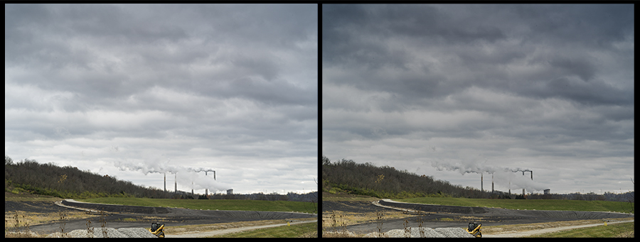
Original Image Imported from ACR (Left), Image with Curves Adjustment Layer (Right)
The next step is to enhance the chiaroscuro in the foreground by adding shadow and highlight details. The idea here is to create subtle value contrasts that help draw the eyes into the foreground. To accomplish this, add a new blank layer and set the blend mode to overlay, and label the layer “Luminosity.” Using the Brush Tool set to a low opacity (5 to 10%), darken shadows and lighten areas of contrast in the foreground, toggling between black and white in the Color Picker (Hit Shift+D to ensure the color picker is set to black and white, and toggle between the two by hitting Shift+X). The key is to make these changes just at the edge of perceptibility. If you find the effect is too strong, you can lower the overall opacity of the layer. (Left image below).

Image with Luminosity Layer (Left), Image with Hue Layer (Right)
Now, we’ll add a color wash, warm in the foreground and cool in the background, to continue to enhance the illusion of depth in the image. To get the desired effect, we’ll add a new blank layer, setting the blend mode to hue and labeling the layer as “Hue.” Using the Brush Tool, select a warm hue using the Color Picker (generally, a warm yellow to gold works best – anywhere between 45-60 on the color wheel). Setting your brush opacity to 50%, paint the hue over the foreground. If the effect is too strong, you can erase and retry at a lower brush opacity. Next, on the same layer, we’ll select a cool blue hue (210 – 250 on the color wheel), and paint over the sky. If the sky is dominant, such as in this example, paint the hue on heavier at the horizon, and lightening up on the top to give the effect of the sky looming overhead and becoming cooler as it moves to the horizon. You can also use a graduated fill layer to get a similar effect. The image above right shows the effect of the added Hue layer.
Next we’ll move on to adjusting saturation. First, add a new blank layer, setting the blend mode to Saturation and labeling it “Saturation.” Then, go to the Color Picker and set the current color to 100% saturation (since the blend mode is set to saturation, it doesn’t matter what the color is, it will only be impacting saturation). Again, using the Brush Tool set to a low opacity (3-5%), paint across your foreground to increase saturation a bit at a time until you get the desire effect. Next, go back to the Color Picker and drop saturation to 0% and switch brush opacity to 10% and begin painting at the horizon and working up into the sky. Again, the horizon line should be less saturated than the sky at the very top of the frame to add the perception of depth. The image below left shows the effect of the saturation changes.
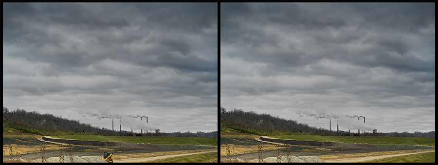
Image with Saturation Layer (Left), Image after Touch-Up Work (Right)
The final step at this point is to do any touch-up work you desire. In this image, I wanted to remove significant distractions as well as dust spots using both the Spot Healing Brush tool in the Content-Aware mode and the Healing Brush Tool. The image above right show the final image. Below are the starting and ending images for comparison.

Initial Image (Left), Final Image (Right)
I hope these techniques are of some use to you. If this method works for you, you may want to consider creating a custom Action to automatically create these adjustment layers and place them in their own Adjustment Layer Group. As I mentioned at the beginning, the tools I discussed are just one of multiple possible ways to accomplish these adjustments, and you may already have a process that works better with your overall workflow. The main idea is to find what techniques will work best for you.
Portfolio: Candice Rollerson
We're very pleased to introduce the work of one of our team members, Candice Rollerson. If you're in San Francisco, go see her work at 688 Sutter Gallery this month!
Life Constructed: A Journey was her final thesis project at the Academy of Art University and it is near and dear to her heart. Each piece was hand-constructed and shot with a 4x5 large format camera.


Outwardly fearless and strong, I draw upon my beautiful mother as my source of strength. "Be a leader, not a follower" is her mantra embedded within me. The pace for my life's journey is set to the rhythmic chant of empowering maternal love. Her power and lessons woven into the fibers of my being allow me to persevere even when I falter from constant paternal pain.
I am a daughter abandoned, left to battle life armed with only half of the parental guidance needed to traverse common milestones and hardships. Yet, even with dragging that negativity into the portions of life where one must walk alone, I have found my own way. Much of what I have accomplished in life -- traveling, teaching and being an artist -- is the direct result of not allowing the negative emotions to take over. However, I felt the whispers of self-doubt creeping in while experiencing life, love and a career. I responded with isolation and self-sabotage, resulting in missteps and missed opportunities. I reached a point in life where I no longer trusted my decisions but knew I had to figure out how to move forward.
Life Constructed: A Journey examines my decisions and experiences in the hopes of understanding them. In order to emerge from the darkness of negativity, I had to rebuild and see things from a different perspective. The cathartic nature of building the sets and capturing them with a 4x5 camera allowed me to create a safe place where I could take my time to revisit emotions--to feel them again and analyze them. Through this process, I remove the power of the negative thoughts and instead, see value in them. This project reveals pain as knowledge and strength.
Post-Processing Techniques for Landscape Photography, Part 1: Corrective Adjustments
by John Ewing
Over the past several weeks I’ve discussed how I go about selecting locations and tracking weather for my work, as well as key tools landscape photographer should have, and have discussed my image capture process. Now I’d like to take a look at image processing and cover a few basic techniques that I use on a regular basis. First, I’ll start with corrective adjustments, which are essentially used to fix misadventures that could have ideally been managed in the field. Next time, I’ll review interpretive adjustments used to enhance and build upon the basic image.
Before I get started, I should provide some detail on my workflow. I use Adobe Camera RAW (ACR) to complete basic global adjustments (i.e. white balance, contrast, initial sharpening, and color adjustment) before opening images in Photoshop (PS) for global fine tuning and local adjustments. Finally, in the spirit of full disclosure, I learned these techniques during my MFA program at AAU in courses such as Contemporary Landscape and Digital Imaging. If you are familiar with ACR and PS, you know that there are a number of ways to accomplish virtually everything. With this in mind, these tips and techniques are not offered as a definitive process, but merely as a way to share how I work. If you aren’t familiar with ACR and PS, there is a wealth of information on the internet, including fantastic tutorials on the Adobe website.
Leveling Horizon Lines: One of the most basic corrective actions is fixing a tilted horizon line. If you’ve forgotten your bubble level, or had to shoot hand-held, this is an easy fix in ACR using the Straighten Tool found in the menu bar; click on the icon that looks like a little bubble level, or uses the shortcut by hitting “A” on your keyboard. To fix your horizon, select the tool, then click-and-drag the tool along your horizon line to create a reference line. It will automatically rotate your image to level the line that you drew and provides a crop box to adjust the image. If you have a really difficult, undulating horizon line, you can also use this to set a vertical line to square the image. To do this you can use a telephone pole or the edge of a building. The longer sample line you can provide, either horizontal or vertical, the more accurate your results will be. Once you’ve identified your reference line, hit Enter and you’re done. Note, this is a cropping adjustment and your image size will be affected; how much depends upon how drastic the correction is.

Using the Straightening Tool
Simulating a Polarizing Filter: This adjustment can provide some of the look of a polarizing filter in event you forgot to bring it along, particularly in darkening a blue sky. You can also use this adjustment to enhancing color saturation, and adding contrast to clouds, but it works best with a clear blue sky. Note, this won’t replace a physical polarizer in removing specular highlights or removing reflections from shiny objects. This adjustment is also completed in ACR. On the Tool Panel, click on the HSL tab and select the Luminance tab. Next select the Targeted Adjustment Tool, the icon looks like a target next to a plus sign (keyboard shortcut “T”). Place your mouse pointer over your sky and click-and-drag down to darken. This will affect all areas of the image in the same color range, so be sure to check the entire image, and not overdo it.
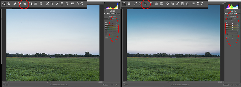
Using the Targeted Adjustment Tool
Simulating a Graduated Neutral Density Filter: This is one corrective adjustment that I use with nearly every storm image I create. I also use it often as an interpretive adjustment, which I’ll cover next time. This adjustment can be applied in ACR during initial processing, or can be added via an adjustment layer in PS where you can control the effect a little more. In ACR, select the Graduated Filter tool in the menu bar, it looks like a graduated filter, or hit “G” on your keyboard. In the Tool Panel, decrease your exposure by 1 to 2 stops to start with, then click in the middle of your image about halfway between the top and your horizon line, and drag down into the lower third of the image to apply the effect. You’ll end up with two parallel horizontal lines. The area above the green dotted line shows the full effect of your adjustment, below the red line, there is no effect. Between the lines is the transition zone. You can drag the lines up and down to determine where the transition begins and ends to achieve the effect desired; you can also adjust the intensity of the exposure change. You can also drag this adjustment at different angles, or from the bottom to accommodate your requirements. Hit Enter when you’re done. Note: as with the previous adjustments, when done in ACR, you can always come back and modify later.

Simulating a Graduated Neutral Density Filter, Before & After
I’ll frequently use a graduated filter to add this effect in Photoshop in conjunction with a layer mask when I want to limit the effect to specific areas, most notably when I have structures in the foreground silhouetted by the sky and want to darken the sky and not the buildings. In this situation, I’ll usually create the effect using a Brightness/Contrast or a Curves layer. Start by selecting the Gradient Tool, this looks like a gradient filter turned sideways, or hit “G” on your keyboard. Next select the Quick Mask mode (keyboard shortcut “Q”) and click-and-drag in your image to create the mask. Note: the red area in Quick Mask mode represents the area that will be masked (hidden), so drag from the bottom, up. If you don’t like the way the mask looks, select Edit>Undo, or “Command + Z” on your keyboard, and try again. When you’re happy with the mask, exit Quick Mask (keyboard shortcut “Q”) and you’ll see the “marching ants” selection. Next create new Brightness/Contrast adjustment layer (my preference in most cases, but you can also use a Curves layer) and adjust the effect as desired. If you want to mask a portion of the adjustment (as previously mentioned), simply create a selection of the item you want to mask, make sure your layer mask is active, and fill with black.

Simulating a Graduated Neutral Density Filter Using a PS Adjustment Layer
Perspective Correction: This adjustment helps eliminate some of the perspective distortion that is inherent in wide angle lenses. When needed, this is generally the last adjustment I will make prior to resizing and sharpening for printing. In PS, select the Perspective Crop Tool, it looks like a warped grid and is collocated with the normal Crop Tool, or just hit “C” on your keyboard. You may need to hit “C” again to toggle between the regular Crop Tool and the Perspective Crop Tool. Click-and-drag from the top left corner of your image to the bottom right corner to select the entire image. When you do this, PS lays out a grid across the image with drag handles in each corner and along each side. Using the corner grab handles, adjust the grids to align with horizontal and vertical lines in the image (i.e. horizon line and/or roof lines for the horizontal axis, and sides of buildings, telephone poles, or trees for the vertical axis.
Once you feel like you have everything lined up, hit Enter. It is best not to try to correct all the distortion, rather, aim to get the perspective close to normal. Trying to fully correct may cause unexpected artifact that looks worse than the initial distortion. If you do make the image worse, hit Command + Z and try again. Also, remember that this is a cropping tool so you’ll lose some of your image in the process. Further, if in the course of making your corrections you drag one of the handles outside of your original image dimensions, you’ll end up with blank spots that you’ll need to fill or crop out.

Perspective Crop Tool, Before & After
I hope these techniques are of some use to you. As I mentioned at the beginning, the tools I discussed are just one of multiple possible ways to accomplish these adjustments, and you may already have a process that works better with your overall workflow. The main idea is to find what techniques will work best for you. Next time, I’ll be looking at interpretive adjustments in PS.