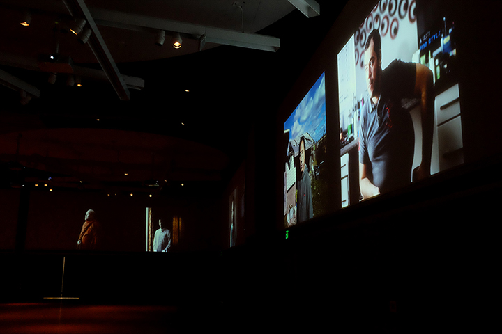


Midlife and the Alchemy of my Individuation is a fine art, self-portrait and landscape series reassessing my past and actualizing my future. This is illustrated through visual representation of the personal transformation phases in Philosophical Alchemy, a process of transforming and perfecting one’s soul. The intent of this series is to encourage reflective thinking by the observer.
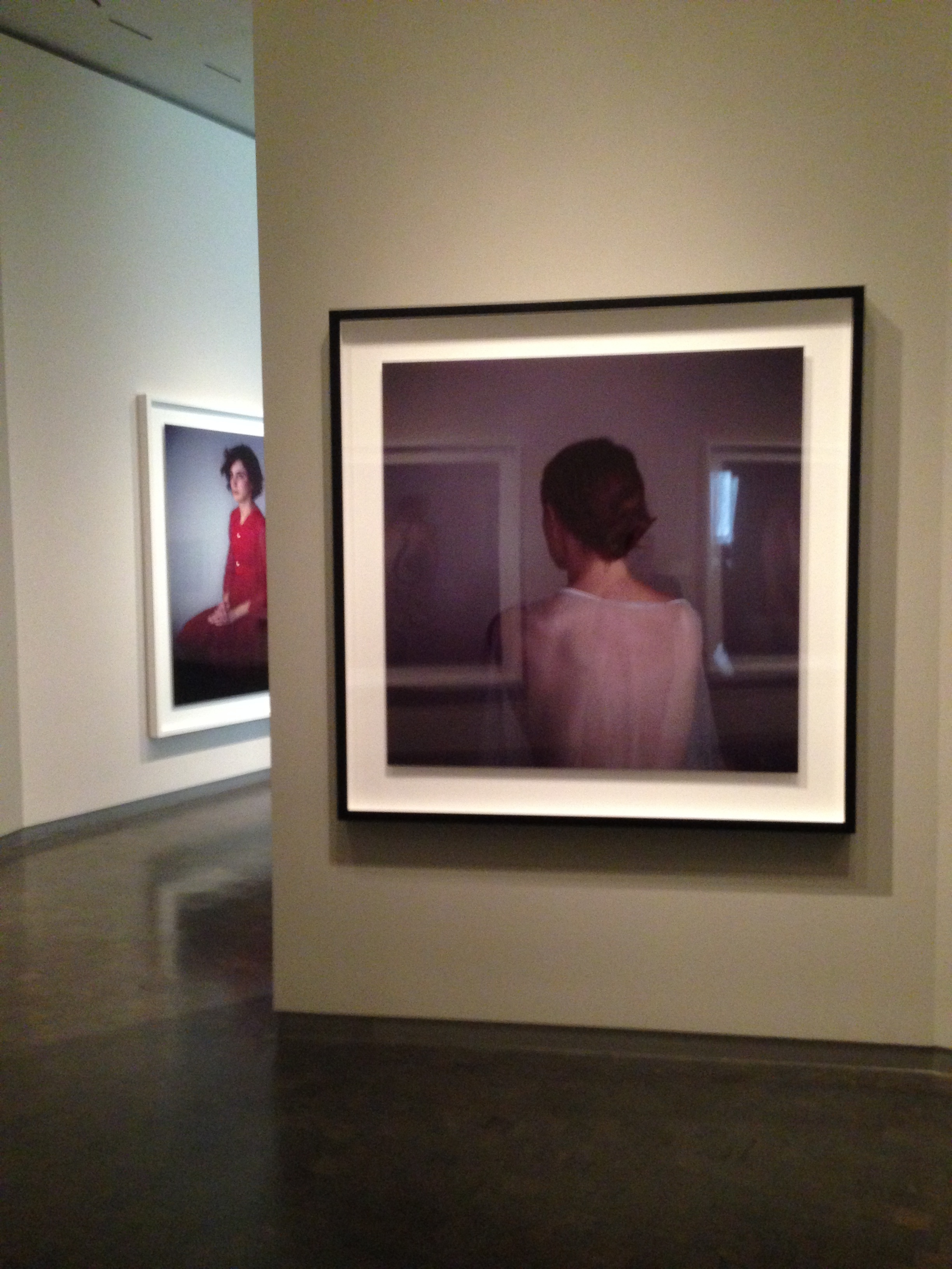
In the Nigredo phase, I deal with the dark matter and negative aspects of myself, illustrated by wearing black in my portraits. During the Albedo phase, I wear white because I have broken down and banished negativity. My soul has been perfected, I am self-aware, and not experiencing darkness anymore. The final phase, Rubedo, is signified by wearing red, a result of becoming stable and aware of myself and surroundings. I now know the secret and have the elixir for the rest of my life.
With the use of Cyanotype, Van Dyke Brown, and inkjet transfers I build my images to narrate my story. The blues are symbolic of my hopes, while the browns illustrate reality. During the process of mixing and painting chemistry, I am freed from the confines of traditional photography and I can coerce chemical reactions, like my reactions between hopes colliding with the real world. In short, one cannot find the secret to life and visualize it without experimentation.
See the full body of work at: http://www.bronwenphoto.com/